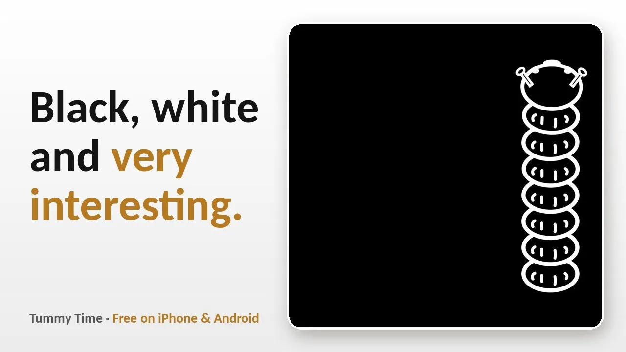
“Why black and white? High-contrast visuals for newborn eyes”
If you’ve ever wondered why so many newborn picture cards are black and white, there’s a simple reason: in the first weeks, babies see the world in soft focus, and strong contrast is what stands out.
What newborns can see
A newborn’s vision is still developing. Fine detail and subtle colour differences are hard to pick out at first, while bold edges — dark against light — are much easier. Over the first months, focus, colour vision and tracking all mature. Your pediatrician can tell you more about what to expect at each check-up.
That’s why black-and-white cards, stripes and simple shapes tend to catch a young baby’s attention more than pastel pictures do.
Why our caterpillar looks the way it does
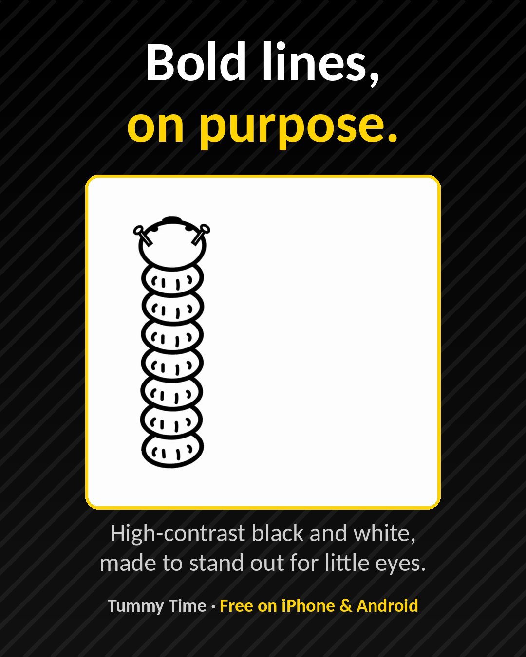
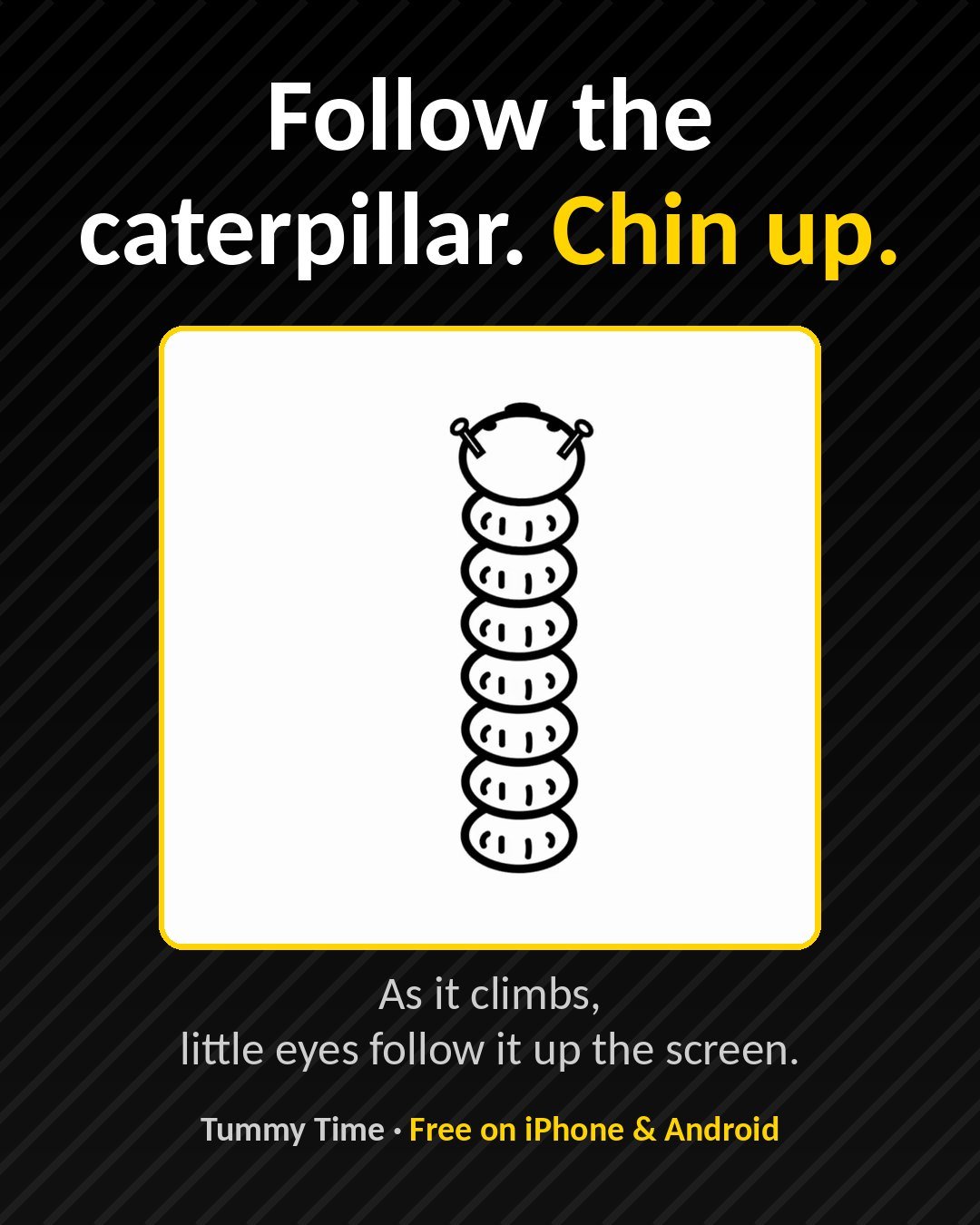
When we designed Tummy Time, we skipped the rainbow on purpose. The caterpillar is drawn in bold black and white, with thick lines and simple shapes, and it moves slowly up the screen so little eyes have time to find it and follow it.
There are two looks:
- Light mode: a black caterpillar on a white screen, free for everyone
- Dark mode (Premium): an inverted white-on-black version, switched with one tap in the toolbar — handy in a dimmer room
Keep it short, keep it close
High contrast is a nice visual target, not a reason for more screen time. A few minutes of tummy time with you right beside your baby is the whole idea — the caterpillar just gives them something worth looking at while they’re on their tummy.
Tummy Time is free to download on iPhone and Android, with no ads.
This post is general information, not medical advice. If you have questions about your baby’s eyesight or development, ask your pediatrician.